I was briefed to create a visual identity for a luxury skincare brand inspired by the founder’s Moroccan heritage. The founder of the brand was looking for a different point of view on beauty that would make the brand stand out from the crowd where whites and pastels were prevailing.
Looking for an authentic feel, we found a lot of inspiration in Moroccan codes that go deeper than the surface level. Rich colors, craftsmanship and a very unique understanding of beauty became a foundation of the brand, guiding visual identity process and strategy.
THE CHALLENGE —
My Role —

Naming
Visual Brand Identity and Creative Strategy
Packaging System
Art Direction
Photography and Video
Web and Digital Design
Visual Merchandising Design
Print Ads
Brand Guidelines
Elegant and curvy lines of Arabic calligraphy inspired the logotype which was designed to be modern yet with a wink to the brand’s main inspiration.
Secondary graphics of the brand are inspired by the “zellige” — old Moroccan mosaics made of tiles. Mosaics were “deconstructed”, where individual tile shapes were turned into graphic elements of the brand.
At the heart of Morocccan aesthetics there are a lot of very earthy, muted colors and scuffed, worn out textures. Both inspired brand color palette, with the main color being terracotta.
VISUAL IDENTITY —
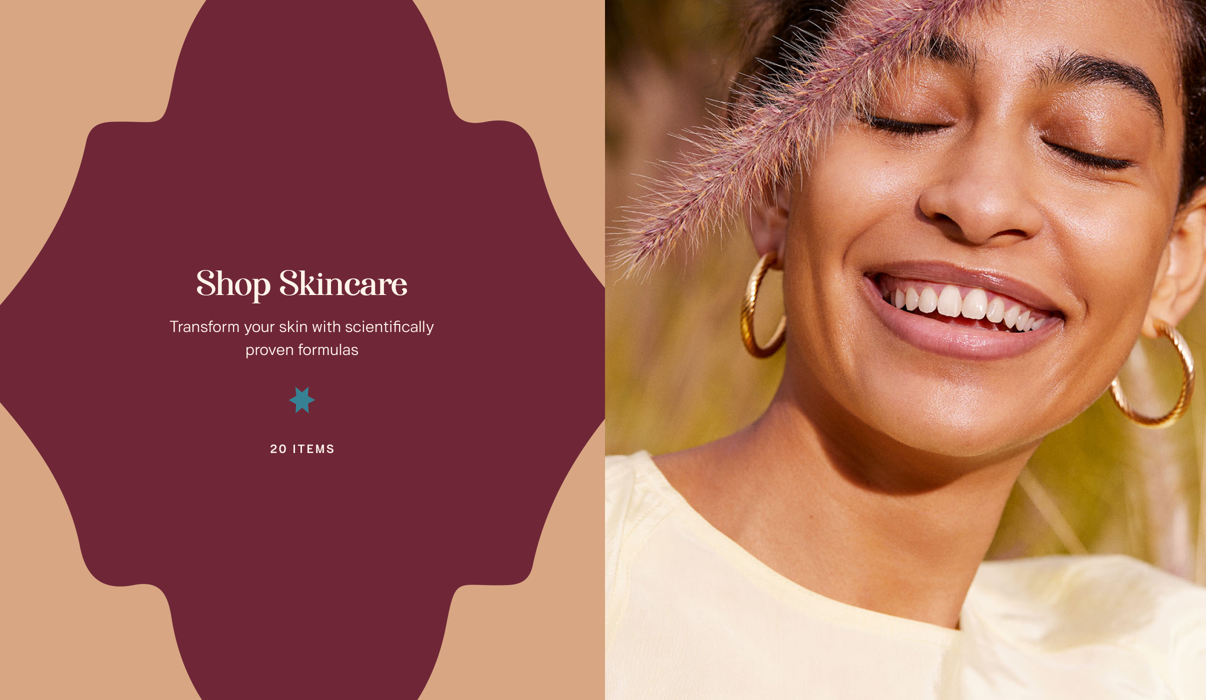
Being inspired by the sun-kissed lands, brands’ photography is full of bright light with an outdoorsy look and feel. Natural beauty, sun-drenched vibe, and inner glow are the staples of the brand visuals.
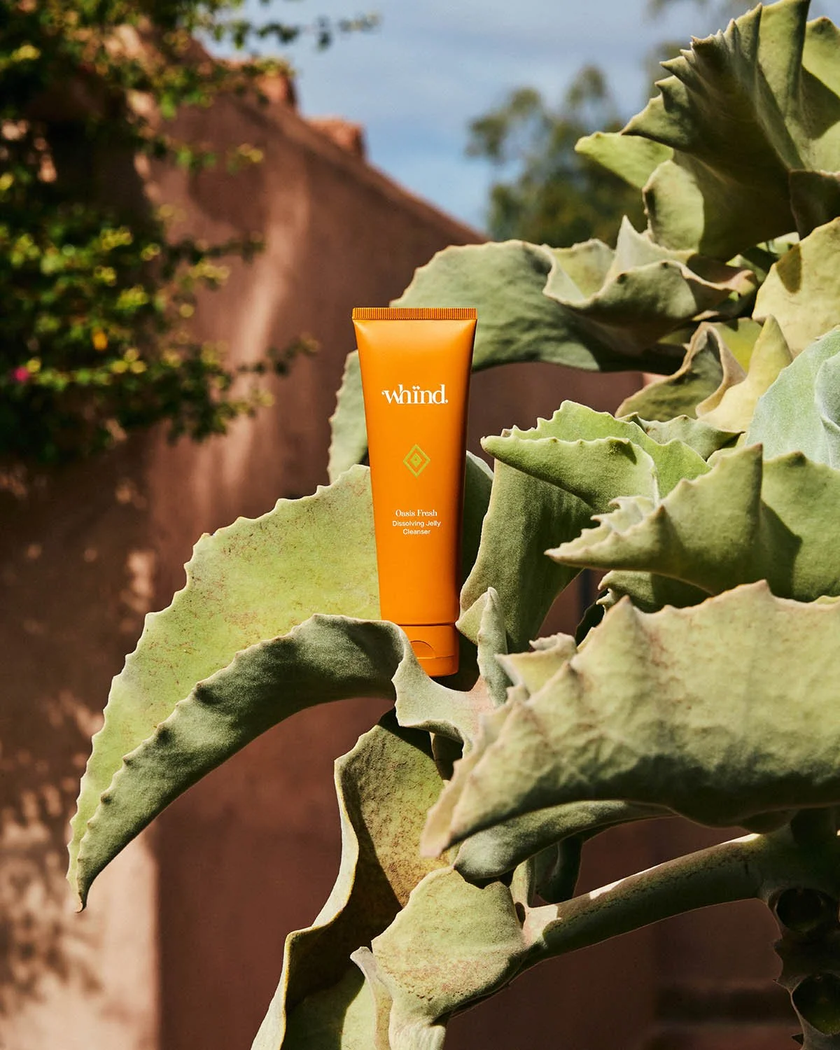
Product photography pays homage to Moroccan craftsmanship, styled in an abstract way with a lighting imitating sun rays.
ART DIRECTION —
The rounded shape of the Tassa bowl, widely used by Moroccan women in Hamamms (baths), inspired the jars' shape. Initial portfolio of the brand included 6 families with different benefits, named after the most famous Moroccan locations (Marrakech, Atlas, Oasis, etc) and got clear navigation with colorful iconography.
With sensoriality and tactile feeling being non-negotiables for the brand we chose custom micro-embossed paper in terraccota color for the secondary packaging.
PACKAGING DESIGN —
Photography: Louis Christopher, Agata Pospieszynska, Aurelie Graillot, Piotr Stolkosa, Joshua Pestka


